This rune is part of @refrakt-md/marketing. Install with npm install @refrakt-md/marketing and add "@refrakt-md/marketing" to the plugins array in your refrakt.config.json.
Bento
A grid of cells. Each cell is a small card living in a grid track. There are two ways to author one — heading sugar (each heading becomes a cell, its depth setting the tile size) or explicit cells ({% bento-cell %} for precise per-tile control). Bento is a grid primitive, not a page-section: it has no eyebrow/title/blurb header. To title a grid, wrap it in a feature or section.
Heading sugar
Each heading becomes a cell; the heading itself is the cell title. Tile size comes from the heading level, with a fixed mapping: # → full, ## → large, ### → medium, ####+ → small. The mapping is absolute, so ### Coral always produces a medium tile regardless of what else is in the grid. Content before the first heading renders loose, above the grid. (Every cell title still renders as an h3 in the DOM — input level is purely a sizing dial.)
{% bento columns=6 %}
## Featured Article

This cell spans two-thirds of the grid across two rows — the hero of the layout.

#### Tip of the Day

A small cell — a third of the grid width — sits beside the hero.

#### Did You Know?

Another small cell tucks under the first, still beside the hero.

### Quick Update

A medium cell, half the grid width.

### Latest News

Another medium pairs alongside.
{% /bento %}<section data-rune="bento" data-rune-fields="{"gap":"1rem","columns":"6","row-height":"","content-height":"","media-ratio":"","collapse":""}">
<div data-name="grid">
<div data-field="cell" data-rune="bento-cell" data-rune-fields="{"size":"large","cols":"4","rows":"2","content-height":"","media-ratio":""}" data-media-position="start">
<h3 id="featured-article" data-name="title">Featured Article</h3>
<div data-name="body">
<p>This cell spans two-thirds of the grid across two rows — the hero of the layout.</p>
</div>
</div>
<div data-field="cell" data-rune="bento-cell" data-rune-fields="{"size":"small","cols":"2","rows":"1","content-height":"","media-ratio":""}" data-media-position="top">
<h3 id="tip-of-the-day" data-name="title">Tip of the Day</h3>
<div data-name="body">
<p>A small cell — a third of the grid width — sits beside the hero.</p>
</div>
</div>
<div data-field="cell" data-rune="bento-cell" data-rune-fields="{"size":"small","cols":"2","rows":"1","content-height":"","media-ratio":""}" data-media-position="top">
<h3 id="did-you-know" data-name="title">Did You Know?</h3>
<div data-name="body">
<p>Another small cell tucks under the first, still beside the hero.</p>
</div>
</div>
<div data-field="cell" data-rune="bento-cell" data-rune-fields="{"size":"medium","cols":"3","rows":"1","content-height":"","media-ratio":""}" data-media-position="top">
<h3 id="quick-update" data-name="title">Quick Update</h3>
<div data-name="body">
<p>A medium cell, half the grid width.</p>
</div>
</div>
<div data-field="cell" data-rune="bento-cell" data-rune-fields="{"size":"medium","cols":"3","rows":"1","content-height":"","media-ratio":""}" data-media-position="top">
<h3 id="latest-news" data-name="title">Latest News</h3>
<div data-name="body">
<p>Another medium pairs alongside.</p>
</div>
</div>
</div>
</section>Featured Article
This cell spans two-thirds of the grid across two rows — the hero of the layout.
Tip of the Day
A small cell — a third of the grid width — sits beside the hero.
Did You Know?
Another small cell tucks under the first, still beside the hero.
Quick Update
A medium cell, half the grid width.
Latest News
Another medium pairs alongside.
<section class="rf-bento" data-columns="6" data-gap="1rem" data-row-height="" data-content-height="" data-media-ratio="" data-collapse="" data-rune="bento" data-density="full" style="--bento-columns: 6; --bento-gap: 1rem">
  <div data-name="grid" class="rf-bento__grid">
    <div data-field="cell" class="rf-bento-cell" data-media-position="start" data-size="large" data-cols="4" data-rows="2" data-content-height="" data-media-ratio="" data-rune="bento-cell" data-density="compact" style="--cell-cols: 4; --cell-rows: 2">
      <div data-name="content" class="rf-bento-cell__content">
        <h3 id="featured-article" data-name="title" class="rf-bento-cell__title">Featured Article</h3>
        <div data-name="body" class="rf-bento-cell__body">
          <p>This cell spans two-thirds of the grid across two rows — the hero of the layout.</p>
        </div>
      </div>
    </div>
    <div data-field="cell" class="rf-bento-cell" data-media-position="top" data-size="small" data-cols="2" data-rows="1" data-content-height="" data-media-ratio="" data-rune="bento-cell" data-density="compact" style="--cell-cols: 2; --cell-rows: 1">
      <div data-name="content" class="rf-bento-cell__content">
        <h3 id="tip-of-the-day" data-name="title" class="rf-bento-cell__title">Tip of the Day</h3>
        <div data-name="body" class="rf-bento-cell__body">
          <p>A small cell — a third of the grid width — sits beside the hero.</p>
        </div>
      </div>
    </div>
    <div data-field="cell" class="rf-bento-cell" data-media-position="top" data-size="small" data-cols="2" data-rows="1" data-content-height="" data-media-ratio="" data-rune="bento-cell" data-density="compact" style="--cell-cols: 2; --cell-rows: 1">
      <div data-name="content" class="rf-bento-cell__content">
        <h3 id="did-you-know" data-name="title" class="rf-bento-cell__title">Did You Know?</h3>
        <div data-name="body" class="rf-bento-cell__body">
          <p>Another small cell tucks under the first, still beside the hero.</p>
        </div>
      </div>
    </div>
    <div data-field="cell" class="rf-bento-cell" data-media-position="top" data-size="medium" data-cols="3" data-rows="1" data-content-height="" data-media-ratio="" data-rune="bento-cell" data-density="compact" style="--cell-cols: 3; --cell-rows: 1">
      <div data-name="content" class="rf-bento-cell__content">
        <h3 id="quick-update" data-name="title" class="rf-bento-cell__title">Quick Update</h3>
        <div data-name="body" class="rf-bento-cell__body">
          <p>A medium cell, half the grid width.</p>
        </div>
      </div>
    </div>
    <div data-field="cell" class="rf-bento-cell" data-media-position="top" data-size="medium" data-cols="3" data-rows="1" data-content-height="" data-media-ratio="" data-rune="bento-cell" data-density="compact" style="--cell-cols: 3; --cell-rows: 1">
      <div data-name="content" class="rf-bento-cell__content">
        <h3 id="latest-news" data-name="title" class="rf-bento-cell__title">Latest News</h3>
        <div data-name="body" class="rf-bento-cell__body">
          <p>Another medium pairs alongside.</p>
        </div>
      </div>
    </div>
  </div>
</section>
Cell sizes
The grid is 6 columns by default. Size presets resolve as proportions of the column count, so a preset holds its ratio at any columns:
| Heading | Size | Span (at 6 cols) | Proportion |
|---|---|---|---|
# (h1) | full | 6 cols × 1 row | full width |
## (h2) | large | 4 cols × 2 rows | ⅔ width, 2 rows |
### (h3) | medium | 3 cols × 1 row | ½ width |
####+ (h4+) | small | 2 cols × 1 row | ⅓ width |
Rows are uniform fixed-height tracks, so a large cell is genuinely twice as tall and a tall guest is bounded by its track rather than ballooning the row. Set the track height with row-height (sm · md · lg · xl), or theme the default via --rf-bento-row-height.
Custom ladders
The tiered presets are a sensible default, but heading level can drive any footprint you like. Set levels to an explicit ladder — a comma-separated list of rungs indexed by heading level (rung 0 = #/h1, rung 1 = ##/h2, rung 2 = ###/h3, and so on). Each rung is either a column count W (one row tall) or a full WxH footprint:
{% bento columns=6 levels="6,3,2" collapse="sm" %}
# Launch

`#` lands on rung 0 — the full width.

## Metrics

`##` lands on rung 1 — half-width, pairs with the next.

## Activity

Half-width.

### Alpha

`###` lands on rung 2 — a third.

### Beta

A third.

### Gamma

A third.
{% /bento %}<section data-rune="bento" data-rune-fields="{"gap":"1rem","columns":"6","row-height":"","content-height":"","media-ratio":"","collapse":"sm"}">
<div data-name="grid">
<div data-field="cell" data-rune="bento-cell" data-rune-fields="{"size":"","cols":"6","rows":"1","content-height":"","media-ratio":""}" data-media-position="top">
<h3 id="launch" data-name="title">Launch</h3>
<div data-name="body">
<p>
<code>#</code>
lands on rung 0 — the full width.
</p>
</div>
</div>
<div data-field="cell" data-rune="bento-cell" data-rune-fields="{"size":"","cols":"3","rows":"1","content-height":"","media-ratio":""}" data-media-position="top">
<h3 id="metrics" data-name="title">Metrics</h3>
<div data-name="body">
<p>
<code>##</code>
lands on rung 1 — half-width, pairs with the next.
</p>
</div>
</div>
<div data-field="cell" data-rune="bento-cell" data-rune-fields="{"size":"","cols":"3","rows":"1","content-height":"","media-ratio":""}" data-media-position="top">
<h3 id="activity" data-name="title">Activity</h3>
<div data-name="body">
<p>Half-width.</p>
</div>
</div>
<div data-field="cell" data-rune="bento-cell" data-rune-fields="{"size":"","cols":"2","rows":"1","content-height":"","media-ratio":""}" data-media-position="top">
<h3 id="alpha" data-name="title">Alpha</h3>
<div data-name="body">
<p>
<code>###</code>
lands on rung 2 — a third.
</p>
</div>
</div>
<div data-field="cell" data-rune="bento-cell" data-rune-fields="{"size":"","cols":"2","rows":"1","content-height":"","media-ratio":""}" data-media-position="top">
<h3 id="beta" data-name="title">Beta</h3>
<div data-name="body">
<p>A third.</p>
</div>
</div>
<div data-field="cell" data-rune="bento-cell" data-rune-fields="{"size":"","cols":"2","rows":"1","content-height":"","media-ratio":""}" data-media-position="top">
<h3 id="gamma" data-name="title">Gamma</h3>
<div data-name="body">
<p>A third.</p>
</div>
</div>
</div>
</section>Launch
# lands on rung 0 — the full width.
Metrics
## lands on rung 1 — half-width, pairs with the next.
Activity
Half-width.
Alpha
### lands on rung 2 — a third.
Beta
A third.
Gamma
A third.
<section class="rf-bento" data-columns="6" data-gap="1rem" data-row-height="" data-content-height="" data-media-ratio="" data-collapse="sm" data-rune="bento" data-density="full" style="--bento-columns: 6; --bento-gap: 1rem">
  <div data-name="grid" class="rf-bento__grid">
    <div data-field="cell" class="rf-bento-cell" data-media-position="top" data-size="" data-cols="6" data-rows="1" data-content-height="" data-media-ratio="" data-rune="bento-cell" data-density="compact" style="--cell-cols: 6; --cell-rows: 1">
      <div data-name="content" class="rf-bento-cell__content">
        <h3 id="launch" data-name="title" class="rf-bento-cell__title">Launch</h3>
        <div data-name="body" class="rf-bento-cell__body">
          <p>
            <code>#</code>
             lands on rung 0 — the full width.
          </p>
        </div>
      </div>
    </div>
    <div data-field="cell" class="rf-bento-cell" data-media-position="top" data-size="" data-cols="3" data-rows="1" data-content-height="" data-media-ratio="" data-rune="bento-cell" data-density="compact" style="--cell-cols: 3; --cell-rows: 1">
      <div data-name="content" class="rf-bento-cell__content">
        <h3 id="metrics" data-name="title" class="rf-bento-cell__title">Metrics</h3>
        <div data-name="body" class="rf-bento-cell__body">
          <p>
            <code>##</code>
             lands on rung 1 — half-width, pairs with the next.
          </p>
        </div>
      </div>
    </div>
    <div data-field="cell" class="rf-bento-cell" data-media-position="top" data-size="" data-cols="3" data-rows="1" data-content-height="" data-media-ratio="" data-rune="bento-cell" data-density="compact" style="--cell-cols: 3; --cell-rows: 1">
      <div data-name="content" class="rf-bento-cell__content">
        <h3 id="activity" data-name="title" class="rf-bento-cell__title">Activity</h3>
        <div data-name="body" class="rf-bento-cell__body">
          <p>Half-width.</p>
        </div>
      </div>
    </div>
    <div data-field="cell" class="rf-bento-cell" data-media-position="top" data-size="" data-cols="2" data-rows="1" data-content-height="" data-media-ratio="" data-rune="bento-cell" data-density="compact" style="--cell-cols: 2; --cell-rows: 1">
      <div data-name="content" class="rf-bento-cell__content">
        <h3 id="alpha" data-name="title" class="rf-bento-cell__title">Alpha</h3>
        <div data-name="body" class="rf-bento-cell__body">
          <p>
            <code>###</code>
             lands on rung 2 — a third.
          </p>
        </div>
      </div>
    </div>
    <div data-field="cell" class="rf-bento-cell" data-media-position="top" data-size="" data-cols="2" data-rows="1" data-content-height="" data-media-ratio="" data-rune="bento-cell" data-density="compact" style="--cell-cols: 2; --cell-rows: 1">
      <div data-name="content" class="rf-bento-cell__content">
        <h3 id="beta" data-name="title" class="rf-bento-cell__title">Beta</h3>
        <div data-name="body" class="rf-bento-cell__body">
          <p>A third.</p>
        </div>
      </div>
    </div>
    <div data-field="cell" class="rf-bento-cell" data-media-position="top" data-size="" data-cols="2" data-rows="1" data-content-height="" data-media-ratio="" data-rune="bento-cell" data-density="compact" style="--cell-cols: 2; --cell-rows: 1">
      <div data-name="content" class="rf-bento-cell__content">
        <h3 id="gamma" data-name="title" class="rf-bento-cell__title">Gamma</h3>
        <div data-name="body" class="rf-bento-cell__body">
          <p>A third.</p>
        </div>
      </div>
    </div>
  </div>
</section>
Two recipes worth knowing:
- Uniform height, width by depth —
levels="6,5,4,3,2,1". Every cell is one row tall, so the grid keeps a flat, even rhythm while width still tracks heading importance. - Varied-height feed —
levels="6x1,6x2,6x3". Full-width cells that grow taller with depth, for a timeline or changelog feel.
A few rules:
- Headings deeper than the ladder clamp to the last rung — write only as many rungs as you have distinct sizes (
levels="6,3,2"covers#/##/###;####and deeper stay a third). - Rungs are absolute column counts measured against
columns; if you changecolumns, revisit the ladder. (The tiered presets, by contrast, are proportional and scale automatically.) - A bento that doesn't use
#can leave rung 0 as a placeholder — only the rungs matching headings you actually write are used. levelsonly affects heading sugar — explicit{% bento-cell %}grids ignore it.
Media zones
A cell's content splits on a top-level --- into media / body / footer zones, exactly like card. The media zone clips and sizes its guest, so any visual rune (chart, map, gallery, mockup, showcase) drops in and adapts automatically.
A media guest is presentational by default. In a cell with href (a stretched whole-tile link), an interactive guest — a codegroup, a live map — is demoted to its static fallback and made pointer-events: none so the whole cell links reliably (and a build warning fires); body/footer controls stay clickable. A non-linked cell hosts interactive guests normally. See the interaction-posture contract.
{% bento columns=6 %}
# Coral reef
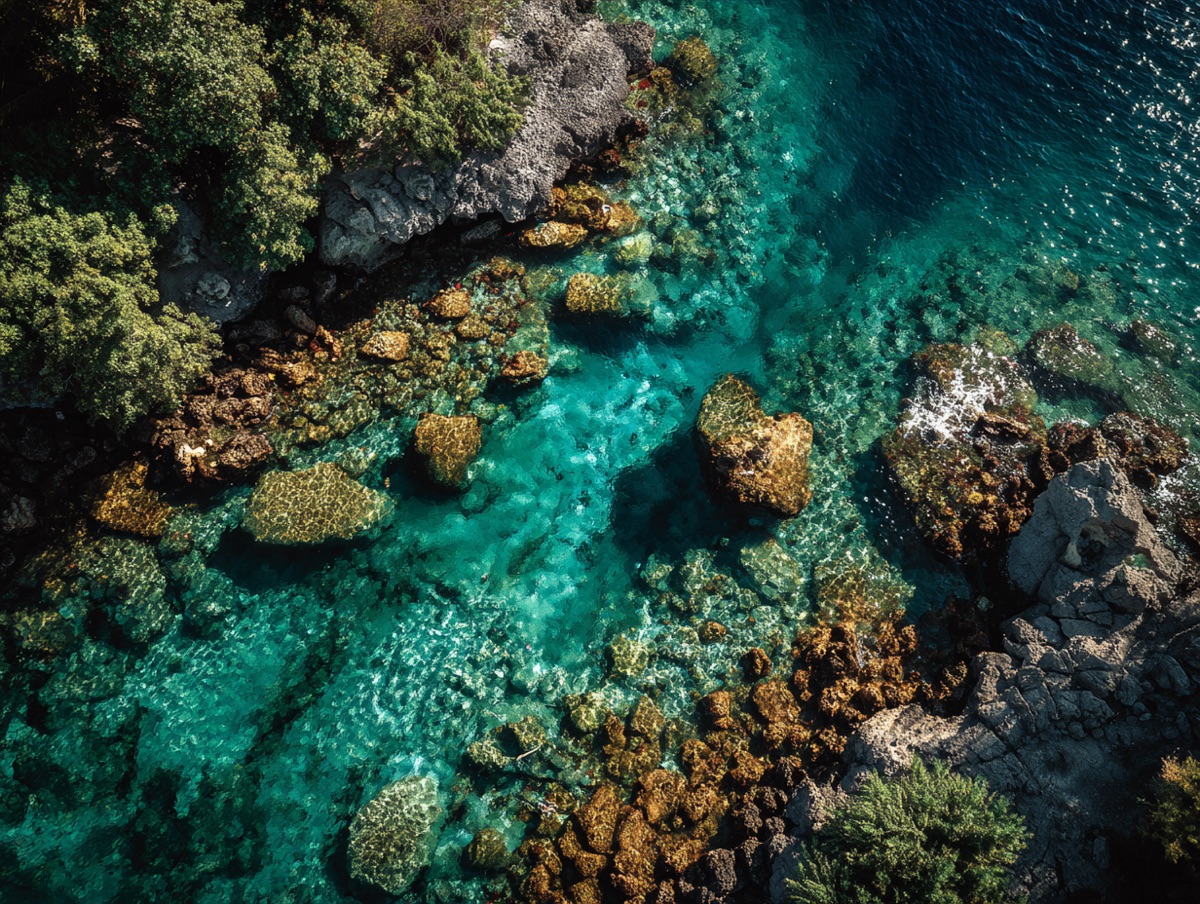
---
Teeming with life beneath turquoise waters — the image fills the cell's media zone.
# Hot springs
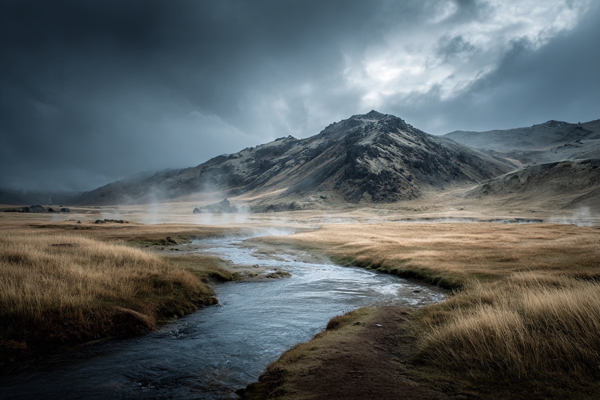
---
Steam rising from the Icelandic highlands.
{% /bento %}<section data-rune="bento" data-rune-fields="{"gap":"1rem","columns":"6","row-height":"","content-height":"","media-ratio":"","collapse":""}">
<div data-name="grid">
<div data-field="cell" data-rune="bento-cell" data-rune-fields="{"size":"full","cols":"6","rows":"1","content-height":"","media-ratio":""}" data-media-position="start">
<div data-section="media" data-name="media">
<img src="https://assets.refrakt.md/figure-coral-reef.jpg" alt="A coral reef teeming with life">
</div>
<h3 id="coral-reef" data-name="title">Coral reef</h3>
<div data-name="body">
<p>Teeming with life beneath turquoise waters — the image fills the cell's media zone.</p>
</div>
</div>
<div data-field="cell" data-rune="bento-cell" data-rune-fields="{"size":"full","cols":"6","rows":"1","content-height":"","media-ratio":""}" data-media-position="start">
<div data-section="media" data-name="media">
<img src="https://assets.refrakt.md/figure-hot-springs.jpg" alt="Volcanic hot springs">
</div>
<h3 id="hot-springs" data-name="title">Hot springs</h3>
<div data-name="body">
<p>Steam rising from the Icelandic highlands.</p>
</div>
</div>
</div>
</section>
Coral reef
Teeming with life beneath turquoise waters — the image fills the cell's media zone.

Hot springs
Steam rising from the Icelandic highlands.
<section class="rf-bento" data-columns="6" data-gap="1rem" data-row-height="" data-content-height="" data-media-ratio="" data-collapse="" data-rune="bento" data-density="full" style="--bento-columns: 6; --bento-gap: 1rem">
  <div data-name="grid" class="rf-bento__grid">
    <div data-field="cell" class="rf-bento-cell" data-media-position="start" data-size="full" data-cols="6" data-rows="1" data-content-height="" data-media-ratio="" data-rune="bento-cell" data-density="compact" style="--cell-cols: 6; --cell-rows: 1">
      <div data-section="media" data-name="media" class="rf-bento-cell__media">
        <img src="https://assets.refrakt.md/figure-coral-reef.jpg" alt="A coral reef teeming with life" />
      </div>
      <div data-name="content" class="rf-bento-cell__content">
        <h3 id="coral-reef" data-name="title" class="rf-bento-cell__title">Coral reef</h3>
        <div data-name="body" class="rf-bento-cell__body">
          <p>Teeming with life beneath turquoise waters — the image fills the cell's media zone.</p>
        </div>
      </div>
    </div>
    <div data-field="cell" class="rf-bento-cell" data-media-position="start" data-size="full" data-cols="6" data-rows="1" data-content-height="" data-media-ratio="" data-rune="bento-cell" data-density="compact" style="--cell-cols: 6; --cell-rows: 1">
      <div data-section="media" data-name="media" class="rf-bento-cell__media">
        <img src="https://assets.refrakt.md/figure-hot-springs.jpg" alt="Volcanic hot springs" />
      </div>
      <div data-name="content" class="rf-bento-cell__content">
        <h3 id="hot-springs" data-name="title" class="rf-bento-cell__title">Hot springs</h3>
        <div data-name="body" class="rf-bento-cell__body">
          <p>Steam rising from the Icelandic highlands.</p>
        </div>
      </div>
    </div>
  </div>
</section>
The first zone is media, the last (when there are three) is the footer:
{% bento-cell %}
## Title
 <!-- media -->
---
Body copy. <!-- body -->
---
Footer note. <!-- footer -->
{% /bento-cell %}
media-position controls where the media sits relative to the body (top | bottom | start | end), with a size-derived default — large/full cells place media beside the body, smaller cells stack it on top. Set it on the bento to default every cell at once (heading-sugar grids included); a cell's own media-position still wins.
Frame & elevation
A bento cell exposes the same two surfaces as card (surface model): elevation floats the cell box (box-shadow), and frame chrome decorates the cell's media zone (aspect, crop anchor, silhouette shadow, oversize). frame-aspect and frame-anchor feed bento's existing media knobs (--bento-media-aspect / --bento-media-anchor) rather than a parallel mechanism.
Because heading-sugar cells have no per-cell attribute surface, grid-level frame (preset + facets) and elevation on the bento cascade to every cell as a default — mirroring media-position; a cell's own value still wins. The grid never takes this chrome itself (the cells are the visual cards) — so {% bento elevation="md" %} lifts each cell, not the grid box.
{% bento columns=6 elevation="sm" frame-aspect="16/9" frame-anchor="center" %}
# Coral reef

---
Teeming with life beneath turquoise waters.
# Hot springs

---
Steam rising from the Icelandic highlands.
{% /bento %}<section data-rune="bento" data-rune-fields="{"gap":"1rem","columns":"6","row-height":"","content-height":"","media-ratio":"","collapse":""}">
<div data-name="grid">
<div data-field="cell" data-rune="bento-cell" data-rune-fields="{"size":"full","cols":"6","rows":"1","content-height":"","media-ratio":""}" data-media-position="start" elevation="sm">
<div data-section="media" data-name="media">
<img src="https://assets.refrakt.md/figure-coral-reef.jpg" alt="A coral reef">
</div>
<h3 id="coral-reef" data-name="title">Coral reef</h3>
<div data-name="body">
<p>Teeming with life beneath turquoise waters.</p>
</div>
<meta data-field="frame-aspect" content="16/9">
<meta data-field="frame-anchor" content="center">
</div>
<div data-field="cell" data-rune="bento-cell" data-rune-fields="{"size":"full","cols":"6","rows":"1","content-height":"","media-ratio":""}" data-media-position="start" elevation="sm">
<div data-section="media" data-name="media">
<img src="https://assets.refrakt.md/figure-hot-springs.jpg" alt="Volcanic hot springs">
</div>
<h3 id="hot-springs" data-name="title">Hot springs</h3>
<div data-name="body">
<p>Steam rising from the Icelandic highlands.</p>
</div>
<meta data-field="frame-aspect" content="16/9">
<meta data-field="frame-anchor" content="center">
</div>
</div>
</section>Coral reef
Teeming with life beneath turquoise waters.
Hot springs
Steam rising from the Icelandic highlands.
<section class="rf-bento" data-columns="6" data-gap="1rem" data-row-height="" data-content-height="" data-media-ratio="" data-collapse="" data-rune="bento" data-density="full" style="--bento-columns: 6; --bento-gap: 1rem">
  <div data-name="grid" class="rf-bento__grid">
    <div data-field="cell" class="rf-bento-cell" data-media-position="start" data-size="full" data-cols="6" data-rows="1" data-content-height="" data-media-ratio="" data-elevation="sm" data-rune="bento-cell" data-density="compact" style="--cell-cols: 6; --cell-rows: 1">
      <div data-section="media" data-name="media" class="rf-bento-cell__media" style="--frame-aspect: 16/9; --frame-anchor: center">
        <img src="https://assets.refrakt.md/figure-coral-reef.jpg" alt="A coral reef" />
      </div>
      <div data-name="content" class="rf-bento-cell__content">
        <h3 id="coral-reef" data-name="title" class="rf-bento-cell__title">Coral reef</h3>
        <div data-name="body" class="rf-bento-cell__body">
          <p>Teeming with life beneath turquoise waters.</p>
        </div>
      </div>
    </div>
    <div data-field="cell" class="rf-bento-cell" data-media-position="start" data-size="full" data-cols="6" data-rows="1" data-content-height="" data-media-ratio="" data-elevation="sm" data-rune="bento-cell" data-density="compact" style="--cell-cols: 6; --cell-rows: 1">
      <div data-section="media" data-name="media" class="rf-bento-cell__media" style="--frame-aspect: 16/9; --frame-anchor: center">
        <img src="https://assets.refrakt.md/figure-hot-springs.jpg" alt="Volcanic hot springs" />
      </div>
      <div data-name="content" class="rf-bento-cell__content">
        <h3 id="hot-springs" data-name="title" class="rf-bento-cell__title">Hot springs</h3>
        <div data-name="body" class="rf-bento-cell__body">
          <p>Steam rising from the Icelandic highlands.</p>
        </div>
      </div>
    </div>
  </div>
</section>
Aligning cells
Two optional knobs keep a grid visually tidy. They act on perpendicular axes — a cell is either a column cell (media stacked top/bottom) or a beside cell (media start/end), so the two never overlap — and each can be set as a grid-wide default or overridden per cell. The grid default is the only lever heading-sugar grids have, since their cells are generated.
content-height(sm·md·lg·xl) pins the text area of column cells to a fixed height, so titles and body copy line up across the row no matter how much each cell says. The media zone absorbs whatever height is left in the track.media-ratio(1/3·2/5·1/2·3/5·2/3) sets how much of a beside cell's width the media takes; the content gets the rest.
{% bento columns=4 levels="2" row-height="lg" content-height="md" media-position="bottom" collapse="sm" %}
### Coral reef

---
Teeming with life beneath turquoise waters.
### Hot springs

---
Steam rising from the Icelandic highlands, where geothermal vents warm the rivers and pools all year round.
{% /bento %}<section data-rune="bento" data-rune-fields="{"gap":"1rem","columns":"4","row-height":"lg","content-height":"md","media-ratio":"","collapse":"sm"}">
<div data-name="grid">
<div data-field="cell" data-rune="bento-cell" data-rune-fields="{"size":"","cols":"2","rows":"1","content-height":"","media-ratio":""}" data-media-position="bottom">
<div data-section="media" data-name="media">
<img src="https://assets.refrakt.md/figure-coral-reef.jpg" alt="A coral reef teeming with life">
</div>
<h3 id="coral-reef" data-name="title">Coral reef</h3>
<div data-name="body">
<p>Teeming with life beneath turquoise waters.</p>
</div>
</div>
<div data-field="cell" data-rune="bento-cell" data-rune-fields="{"size":"","cols":"2","rows":"1","content-height":"","media-ratio":""}" data-media-position="bottom">
<div data-section="media" data-name="media">
<img src="https://assets.refrakt.md/figure-hot-springs.jpg" alt="Volcanic hot springs">
</div>
<h3 id="hot-springs" data-name="title">Hot springs</h3>
<div data-name="body">
<p>Steam rising from the Icelandic highlands, where geothermal vents warm the rivers and pools all year round.</p>
</div>
</div>
</div>
</section>Coral reef
Teeming with life beneath turquoise waters.
Hot springs
Steam rising from the Icelandic highlands, where geothermal vents warm the rivers and pools all year round.
<section class="rf-bento" data-columns="4" data-gap="1rem" data-row-height="lg" data-content-height="md" data-media-ratio="" data-collapse="sm" data-rune="bento" data-density="full" style="--bento-columns: 4; --bento-gap: 1rem">
  <div data-name="grid" class="rf-bento__grid">
    <div data-field="cell" class="rf-bento-cell" data-media-position="bottom" data-size="" data-cols="2" data-rows="1" data-content-height="" data-media-ratio="" data-rune="bento-cell" data-density="compact" style="--cell-cols: 2; --cell-rows: 1">
      <div data-section="media" data-name="media" class="rf-bento-cell__media">
        <img src="https://assets.refrakt.md/figure-coral-reef.jpg" alt="A coral reef teeming with life" />
      </div>
      <div data-name="content" class="rf-bento-cell__content">
        <h3 id="coral-reef" data-name="title" class="rf-bento-cell__title">Coral reef</h3>
        <div data-name="body" class="rf-bento-cell__body">
          <p>Teeming with life beneath turquoise waters.</p>
        </div>
      </div>
    </div>
    <div data-field="cell" class="rf-bento-cell" data-media-position="bottom" data-size="" data-cols="2" data-rows="1" data-content-height="" data-media-ratio="" data-rune="bento-cell" data-density="compact" style="--cell-cols: 2; --cell-rows: 1">
      <div data-section="media" data-name="media" class="rf-bento-cell__media">
        <img src="https://assets.refrakt.md/figure-hot-springs.jpg" alt="Volcanic hot springs" />
      </div>
      <div data-name="content" class="rf-bento-cell__content">
        <h3 id="hot-springs" data-name="title" class="rf-bento-cell__title">Hot springs</h3>
        <div data-name="body" class="rf-bento-cell__body">
          <p>Steam rising from the Icelandic highlands, where geothermal vents warm the rivers and pools all year round.</p>
        </div>
      </div>
    </div>
  </div>
</section>
Both cells pin their text to the same height, so the captions align even though one is longer. For a beside cell, reach for media-ratio instead:
{% bento-cell size="large" media-ratio="1/3" %}
## Spotlight

---
The image takes a third of the width; the copy fills the rest.
{% /bento-cell %}
Set either on the bento to establish a grid-wide default, then override it on an individual {% bento-cell %}. Both revert to natural height / the default split on the mobile stack.
Explicit cells
For full per-tile control (the dashboard case), author {% bento-cell %} tags directly. When a bento contains explicit cells, heading sugar is short-circuited — the cells are used as-is. Each cell accepts precise cols / rows spans, a size preset, media-position, and an href that turns the whole tile into a link.
{% bento columns=6 %}
{% bento-cell cols=4 rows=2 href="/runes/rune-catalog" %}
## Overview

The hero tile spans four columns and two rows, and the whole cell links out.
{% /bento-cell %}

{% bento-cell cols=2 media-position="end" %}
## Sidebar

A two-column companion tile.
{% /bento-cell %}
{% /bento %}<section data-rune="bento" data-rune-fields="{"gap":"1rem","columns":"6","row-height":"","content-height":"","media-ratio":"","collapse":""}">
<div data-name="grid">
<div data-field="cell" data-rune="bento-cell" data-rune-fields="{"size":"medium","cols":"4","rows":"2","content-height":"","media-ratio":""}" data-media-position="top">
<h3 id="overview" data-name="title">Overview</h3>
<div data-name="body">
<p>The hero tile spans four columns and two rows, and the whole cell links out.</p>
</div>
<a data-name="link" href="/runes/rune-catalog" aria-hidden="true" tabindex="-1"></a>
</div>
<div data-field="cell" data-rune="bento-cell" data-rune-fields="{"size":"medium","cols":"2","rows":"1","content-height":"","media-ratio":""}" data-media-position="end">
<h3 id="sidebar" data-name="title">Sidebar</h3>
<div data-name="body">
<p>A two-column companion tile.</p>
</div>
</div>
</div>
</section>Overview
The hero tile spans four columns and two rows, and the whole cell links out.
Sidebar
A two-column companion tile.
<section class="rf-bento" data-columns="6" data-gap="1rem" data-row-height="" data-content-height="" data-media-ratio="" data-collapse="" data-rune="bento" data-density="full" style="--bento-columns: 6; --bento-gap: 1rem">
  <div data-name="grid" class="rf-bento__grid">
    <div data-field="cell" class="rf-bento-cell" data-media-position="top" data-size="medium" data-cols="4" data-rows="2" data-content-height="" data-media-ratio="" data-rune="bento-cell" data-density="compact" style="--cell-cols: 4; --cell-rows: 2">
      <div data-name="content" class="rf-bento-cell__content">
        <h3 id="overview" data-name="title" class="rf-bento-cell__title">Overview</h3>
        <div data-name="body" class="rf-bento-cell__body">
          <p>The hero tile spans four columns and two rows, and the whole cell links out.</p>
        </div>
      </div>
      <a data-name="link" href="/runes/rune-catalog" aria-hidden="true" tabindex="-1" class="rf-bento-cell__link"></a>
    </div>
    <div data-field="cell" class="rf-bento-cell" data-media-position="end" data-size="medium" data-cols="2" data-rows="1" data-content-height="" data-media-ratio="" data-rune="bento-cell" data-density="compact" style="--cell-cols: 2; --cell-rows: 1">
      <div data-name="content" class="rf-bento-cell__content">
        <h3 id="sidebar" data-name="title" class="rf-bento-cell__title">Sidebar</h3>
        <div data-name="body" class="rf-bento-cell__body">
          <p>A two-column companion tile.</p>
        </div>
      </div>
    </div>
  </div>
</section>
Mixing headings and explicit cells in one grid is not a supported pattern — if any explicit cell is present, loose headings are ignored.
Responsive collapse
Collapse is binary. Above the chosen breakpoint, the grid renders exactly as authored — your columns and per-cell cols/rows are honored without reflow. Below it, the grid drops to a single stacked column with auto row tracks (cells size to their content; nothing clips). The span auto-cap still applies, so a cell wider than columns is bounded to the grid even before collapse.
{% bento collapse="md" %}
| Value | Collapses to one column at |
|---|---|
sm (default) | 640px container width |
md | 768px container width |
lg | 1024px container width |
never | never collapses |
Choose collapse to match the narrowest width your authored grid can comfortably hold. A 6-column grid with wide cells probably wants md or lg; a small grid of small cells can stay at sm. There is no intermediate column reduction by default — if the grid genuinely needs to fit a range of container widths, pick columns for the lowest acceptable width and let the wider container render the cells with extra breathing room.
Attributes
bento
| Attribute | Type | Default | Description |
|---|---|---|---|
columns | number | 6 | Number of grid columns |
gap | string | 1rem | Grid gap |
levels | string | — | Heading-sugar footprint ladder, by absolute heading level (rung 0 = h1, rung 1 = h2, …): rungs of W (cols, 1 row) or WxH, e.g. 6,5,4,3,2,1 or 4x2,3x1,2x1. Overrides tiered sizing; ignored for explicit-cell grids |
row-height | string | md | Uniform row track height: sm, md, lg, or xl |
content-height | string | — | Grid default — pin column cells' text height: sm, md, lg, or xl |
media-ratio | string | — | Grid default — media's share of a beside cell's width: 1/3, 2/5, 1/2, 3/5, or 2/3 |
media-position | string | size-derived | Grid default media placement for every cell: top, bottom, start, or end. A cell's own media-position wins |
frame / frame-* | string | — | Grid default frame chrome cascaded to every cell's media zone (SPEC-086); a cell's own frame-* wins. See surfaces |
elevation | string | — | Cascades to every cell's box-shadow (none/sm/md/lg) — lifts the cells, not the grid box; a cell's own elevation wins |
collapse | string | sm | Binary stack breakpoint: sm (640px), md (768px), lg (1024px), or never |
bento-cell
| Attribute | Type | Default | Description |
|---|---|---|---|
size | string | medium | Size preset: small, medium, large, or full |
cols | number | — | Explicit column span (overrides size width) |
rows | number | — | Explicit row span (overrides size height) |
media-position | string | size-derived | Media placement: top, bottom, start, or end |
content-height | string | grid default | Override the grid content-height for this cell: sm, md, lg, or xl |
media-ratio | string | grid default | Override the grid media-ratio for this cell: 1/3, 2/5, 1/2, 3/5, or 2/3 |
href | string | — | Makes the whole cell a link |
frame / frame-* | string | grid default | Frame chrome on the cell's media zone (aspect, anchor, shadow, …) — see surfaces |
Common attributes
All block runes share these attributes for layout and theming.
| Attribute | Type | Default | Description |
|---|---|---|---|
width | string | content | Page grid width: content, wide, or full |
spacing | string | — | Vertical spacing: flush, tight, default, loose, or breathe |
inset | string | — | Horizontal padding: flush, tight, default, loose, or breathe |
tint | string | — | Named colour tint from theme configuration |
tint-mode | string | auto | Colour scheme override: auto, dark, or light |
bg | string | — | Named background preset from theme configuration |
Cells are tint-deferrable: apply tint / tint-mode to an individual {% bento-cell %} for a multi-coloured grid.