Card
{% card %} is a generic content card: a bordered surface with an optional media zone, a body, and an optional footer. It carries no knowledge of the registry or $item — it's a plain presentational component you can drop into prose, or feed from a collection body template.
There is one generic card (named by shape, not by entity) — refrakt deliberately has no article-card / recipe-card / per-entity card runes. A designed list item is {% card %} fed by entity fields, not a bespoke card per type.
{% card href="/runes/collection" %}
---
### Collection rune
The plural counterpart to `ref` and `expand` — query the registry and render the results.

---

Core rune · see also `expand`
{% /card %}<div data-rune="card" data-rune-fields="{"media-position":"top"}">
<div data-name="body">
<h3 id="collection-rune" data-name="title">Collection rune</h3>
<p>
The plural counterpart to
<code>ref</code>
and
<code>expand</code>
— query the registry and render the results.
</p>
</div>
<footer data-name="footer">
<p>
Core rune · see also
<code>expand</code>
</p>
</footer>
<a data-name="link" href="/runes/collection" aria-hidden="true" tabindex="-1"></a>
</div>Collection rune
The plural counterpart to ref and expand — query the registry and render the results.
<div class="rf-card" data-media-position="top" data-rune="card" data-density="full">
  <div data-name="content" class="rf-card__content">
    <div data-name="body" class="rf-card__body">
      <h3 id="collection-rune" data-name="title" class="rf-card__title">Collection rune</h3>
      <p>
        The plural counterpart to
        <code>ref</code>
         and
        <code>expand</code>
         — query the registry and render the results.
      </p>
    </div>
    <footer data-name="footer" class="rf-card__footer">
      <p>
        Core rune · see also
        <code>expand</code>
      </p>
    </footer>
  </div>
  <a data-name="link" href="/runes/collection" aria-hidden="true" tabindex="-1" class="rf-card__link"></a>
</div>
Zones
The body divides on --- (a horizontal rule) into up to three zones — here all three, with a real cover image:
{% card href="/runes/learning/recipe" media-position="start" %}
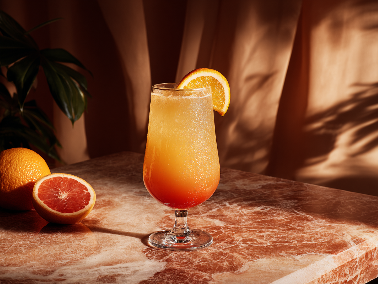
---
Brunch classic
### Tequila Sunrise
A bright, layered cocktail — five minutes, no shaker.
---
Cocktail · Easy
{% /card %}<div data-rune="card" data-rune-fields="{"media-position":"start"}">
<div data-section="media" data-name="media">
<img src="https://assets.refrakt.md/tequila-sunrise.png" alt="A tequila sunrise cocktail">
</div>
<p data-name="eyebrow">Brunch classic</p>
<div data-name="body">
<h3 id="tequila-sunrise" data-name="title">Tequila Sunrise</h3>
<p>A bright, layered cocktail — five minutes, no shaker.</p>
</div>
<footer data-name="footer">
<p>Cocktail · Easy</p>
</footer>
<a data-name="link" href="/runes/learning/recipe" aria-hidden="true" tabindex="-1"></a>
</div>
Brunch classic
Tequila Sunrise
A bright, layered cocktail — five minutes, no shaker.
<div class="rf-card" data-media-position="start" data-rune="card" data-density="full">
  <div data-section="media" data-name="media" class="rf-card__media" data-guest-posture="presentational">
    <img src="https://assets.refrakt.md/tequila-sunrise.png" alt="A tequila sunrise cocktail" />
  </div>
  <div data-name="content" class="rf-card__content">
    <p data-name="eyebrow" class="rf-card__eyebrow">Brunch classic</p>
    <div data-name="body" class="rf-card__body">
      <h3 id="tequila-sunrise" data-name="title" class="rf-card__title">Tequila Sunrise</h3>
      <p>A bright, layered cocktail — five minutes, no shaker.</p>
    </div>
    <footer data-name="footer" class="rf-card__footer">
      <p>Cocktail · Easy</p>
    </footer>
  </div>
  <a data-name="link" href="/runes/learning/recipe" aria-hidden="true" tabindex="-1" class="rf-card__link"></a>
</div>- media (optional, leading zone) — laid out beside the body on wide screens and as a full-bleed header on small screens.
- body — the main content.
- footer (optional, trailing zone) — a muted meta row.
Zones are assigned by count: 1 zone → body; 2 → media + body; 3 → media + body + footer. To have a footer with no media, lead with an empty zone (--- body --- footer).
In the body zone, a leading paragraph immediately followed by a heading is treated as an eyebrow — the small uppercase kicker above the title (the same pattern as page-section and recipe). Above, Brunch classic is the eyebrow over the Tequila Sunrise heading.
The media zone isn't just images
The media zone holds any content — it's ordinary markdown, transformed in place. An image is the common case, but a {% codegroup %}, a {% sandbox %}, a chart, or a video embed work equally well:
{% card %}
{% codegroup %}
```js
export const sum = (a, b) => a + b;
```
```py
def sum(a, b): return a + b
```
{% /codegroup %}

---

### Tiny utilities
A starter kit of one-liners.
{% /card %}<div data-rune="card" data-rune-fields="{"media-position":"top"}">
<div data-section="media" data-name="media">
<section data-rune="code-group">
<div role="tablist" data-name="tabs">
<button data-name="tab" role="tab">
<span>JavaScript</span>
</button>
<button data-name="tab" role="tab">
<span>Python</span>
</button>
</div>
<div data-name="panels">
<div role="tabpanel" data-name="panel">
<div class="rf-codeblock">
<pre data-language="js">
<code data-language="js">export const sum = (a, b) => a + b;
</code>
</pre>
</div>
</div>
<div role="tabpanel" data-name="panel">
<div class="rf-codeblock">
<pre data-language="py">
<code data-language="py">def sum(a, b): return a + b
</code>
</pre>
</div>
</div>
</div>
</section>
</div>
<div data-name="body">
<h3 id="tiny-utilities" data-name="title">Tiny utilities</h3>
<p>A starter kit of one-liners.</p>
</div>
</div>export const sum = (a, b) => a + b;
def sum(a, b): return a + b
Tiny utilities
A starter kit of one-liners.
<div class="rf-card" data-media-position="top" data-rune="card" data-density="full">
<div data-section="media" data-name="media" class="rf-card__media">
<section class="rf-codegroup rf-codegroup--scroll" data-overflow="scroll" data-rune="code-group" data-density="compact" data-code-host="true">
<div role="tablist" data-name="tabs" class="rf-codegroup__tabs">
<button data-name="tab" role="tab" class="rf-codegroup__tab">
<span>JavaScript</span>
</button>
<button data-name="tab" role="tab" class="rf-codegroup__tab">
<span>Python</span>
</button>
</div>
<div data-name="panels" class="rf-codegroup__panels">
<div role="tabpanel" data-name="panel" class="rf-codegroup__panel">
<div class="rf-codeblock">
<pre data-language="js"><code data-language="js">export const sum = (a, b) => a + b;
</code></pre>
</div>
</div>
<div role="tabpanel" data-name="panel" class="rf-codegroup__panel">
<div class="rf-codeblock">
<pre data-language="py"><code data-language="py">def sum(a, b): return a + b
</code></pre>
</div>
</div>
</div>
</section>
</div>
<div data-name="content" class="rf-card__content">
<div data-name="body" class="rf-card__body">
<h3 id="tiny-utilities" data-name="title" class="rf-card__title">Tiny utilities</h3>
<p>A starter kit of one-liners.</p>
</div>
</div>
</div>Whole-card links
href makes the entire card clickable. It's rendered as a stretched-link overlay, so real links inside the body or footer stay clickable too (no invalid nested <a>).
{% card href="/guide/getting-started/" %}
### Getting started
Read the five-minute guide.
{% /card %}
Media guests in a linked card
A linked card is one interaction target, so its media guest is presentational. An interactive guest in the media zone — a codegroup, tabs, a live map — is demoted: its controls go pointer-events: none (clicks fall through to the card link) and it renders its static fallback rather than live chrome. The demotion is scoped to the media zone only — a button or link in the body/footer stays clickable. Authoring an interactive guest in a linked card emits a build warning; drop href or the interactivity. In cover mode the media is always an inert backdrop, linked or not. See the interaction-posture contract for the full model.
Layout attributes
card shares the media+content layout vocabulary with bento-cell and every other media-bearing rune. The body splits on --- into media → body → footer (media-first, in source order); media-position decides where the media sits visually, independently of source order.
| Attribute | Type | Default | Description |
|---|---|---|---|
media-position | string | top | Where the media sits: top, bottom, start (left), end (right), or cover (media fills the card, content overlays — see below) |
media-ratio | string | — | Media zone's share of the row when beside content (start/end): 1/3, 2/5, 1/2, 3/5, 2/3 |
valign | string | — | Cross-axis alignment when media is beside content: top, center, bottom, stretch |
collapse | string | — | Breakpoint at which beside layouts collapse to a stack: sm, md, lg, never |
content-place | string | auto | Cover only. Where the overlaid content anchors: <block> <inline> (each start/center/end), or auto to adapt to orientation |
height | string | — | Intrinsic card height (named scale sm/md/lg/xl) — gives a cover or bg-only card a poster shape |
aspect | string | — | Intrinsic card aspect ratio (e.g. 16/9, 3/4) — the proportional alternative to height |
href | string | — | Optional whole-card link target |
Elevation & frame
A card exposes two decorable surfaces (surface model): the self surface (the card box) takes elevation — a box-shadow that floats the whole tile — and the media surface (the [data-section="media"] zone) takes frame chrome: aspect, crop anchor, a silhouette drop-shadow, displacement, and oversize. The two never collide — elevation is the card's z-shadow, frame-shadow is the photo's silhouette.
{% card elevation="md" frame-aspect="16/9" frame-anchor="top left" %}

---
### Framed media
`elevation` floats the card; `frame-*` presents the image in its media zone.
{% /card %}<div data-rune="card" data-rune-fields="{"media-position":"top"}" elevation="md">
<div data-section="media" data-name="media">
<img src="https://picsum.photos/seed/carddash/800/450" alt="Dashboard">
</div>
<div data-name="body">
<h3 id="framed-media" data-name="title">Framed media</h3>
<p>
<code>elevation</code>
floats the card;
<code>frame-*</code>
presents the image in its media zone.
</p>
</div>
<meta data-field="frame-aspect" content="16/9">
<meta data-field="frame-anchor" content="top left">
</div>Framed media
elevation floats the card; frame-* presents the image in its media zone.
<div class="rf-card" data-media-position="top" data-elevation="md" data-rune="card" data-density="full">
  <div data-section="media" data-name="media" class="rf-card__media" style="--frame-aspect: 16/9; --frame-anchor: top left">
    <img src="https://picsum.photos/seed/carddash/800/450" alt="Dashboard" />
  </div>
  <div data-name="content" class="rf-card__content">
    <div data-name="body" class="rf-card__body">
      <h3 id="framed-media" data-name="title" class="rf-card__title">Framed media</h3>
      <p>
        <code>elevation</code>
         floats the card;
        <code>frame-*</code>
         presents the image in its media zone.
      </p>
    </div>
  </div>
</div>
elevation floats the card box (none/sm/md/lg); frame (or a named preset from theme/project config) decorates the media zone. Because the media zone is a clipping host, a displaced or oversized guest is cropped into a peek — frame-anchor picks the focal point. See surfaces for the full facet list.
Cover mode
media-position="cover" is the poster layout: the media well fills the card interior and the body overlays it. It's a one-attribute switch from top/bottom/start/end — the same content, restacked. The media stays a media guest, so the thin edge and --rf-radius-media are preserved; nothing else about the card changes.
{% card href="/runes/learning/recipe" media-position="cover" scrim-type="frost" scrim-blur="md" height="lg" %}

---
Brunch classic
### Tequila Sunrise
A bright, layered cocktail — five minutes, no shaker.
{% /card %}<div data-rune="card" data-rune-fields="{"media-position":"cover","height":"lg"}">
<div data-section="media" data-name="media">
<img src="https://assets.refrakt.md/tequila-sunrise.png" alt="A tequila sunrise cocktail">
</div>
<p data-name="eyebrow">Brunch classic</p>
<div data-name="body">
<h3 id="tequila-sunrise" data-name="title">Tequila Sunrise</h3>
<p>A bright, layered cocktail — five minutes, no shaker.</p>
</div>
<a data-name="link" href="/runes/learning/recipe" aria-hidden="true" tabindex="-1"></a>
<meta data-field="scrim-type" content="frost">
<meta data-field="scrim-blur" content="md">
</div>Brunch classic
Tequila Sunrise
A bright, layered cocktail — five minutes, no shaker.
<div class="rf-card rf-card--cover" data-media-position="cover" data-height="lg" data-scrim-type="frost" data-scrim-blur="md" data-rune="card" data-density="full" data-cover-scope="full">
  <div data-section="media" data-name="media" class="rf-card__media" data-guest-posture="presentational">
    <img src="https://assets.refrakt.md/tequila-sunrise.png" alt="A tequila sunrise cocktail" />
  </div>
  <div data-name="content" class="rf-card__content" data-color-scheme="dark">
    <p data-name="eyebrow" class="rf-card__eyebrow">Brunch classic</p>
    <div data-name="body" class="rf-card__body">
      <h3 id="tequila-sunrise" data-name="title" class="rf-card__title">Tequila Sunrise</h3>
      <p>A bright, layered cocktail — five minutes, no shaker.</p>
    </div>
  </div>
  <a data-name="link" href="/runes/learning/recipe" aria-hidden="true" tabindex="-1" class="rf-card__link"></a>
</div>
A cover card has no natural height (there's no side-by-side content to set it), so give it one with height (the named scale sm/md/lg/xl) or aspect (e.g. aspect="3/4"). When the card sits in an external grid track (a bento cell, a collection row), the track wins; otherwise height/aspect set the shape, falling back to a portrait default. height/aspect are also the standalone analog of a bento row-span for a bg-only card — a card with no media at all, just a background fill, needs an intrinsic height to show.
Placing the overlay — content-place
content-place anchors the overlaid content. It's a two-axis logical value — <block> <inline>, each start / center / end — mapping to align/justify. The default, auto, adapts to the card's own orientation via a container query: a portrait card drops the content to the block end (a caption band), a landscape card pulls it to the inline start (a side panel). Pin it with an explicit value, e.g. content-place="center center" for a centred hero.
content-place is inert outside cover mode — there's no overlay to anchor — and the engine warns if you set it on a non-cover card.
The cover scrim
Overlaying text on an arbitrary photo is a legibility footgun, so cover mode turns on a default scrim on the media surface — a gradient weighted toward the content edge (it follows content-place, and you can pin it with an explicit scrim="top|bottom|left|right"). The example above instead uses the frost treatment (scrim-type="frost", with scrim-blur on the none/sm/md/lg scale): a frosted-glass blur banded behind the text rather than a gradient. Either way the scrim is masked to the content edge so it never blurs or darkens the whole image, and the foreground reads against the darkened media automatically (scrim-tone controls the polarity — a dark scrim yields light text). Opt out with scrim="none", or set a tint for a bespoke overlay colour.
The scheme is scoped to the overlaid text, not the whole card: the card's own surface — the padded edge framing the media well — keeps the page palette (light in light mode, dark in dark mode), while only the text sitting on the image flips to stay legible.
In a recipe, cover mode uses header scope: only the title block overlays the image (a poster header), and the ingredients/steps flow below on the page palette — the same media-position="cover" switch, scoped to the part that should sit on the image.
Feeding a card from a collection
Because the card is plain, a collection body template wires entity fields into it — the card neither knows nor cares that it's in a collection:
{% collection type="page" filter="url:/blog/*" sort="date-desc" layout="grid" %}
{% card href=$item.url %}
### {% $item.data.title %}
{% date($item.data.date) %} — {% $item.data.description %}
{% /card %}
{% /collection %}
See collection → per-item templates for the $item contract.
In a grid, every card in a row shares the height of the tallest one, and the body stretches to fill that height — so the footers line up along a common baseline regardless of how much body each card has.
Output contract
<div class="rf-card" data-rune="card" data-media-position="top">
  <div data-section="media" data-name="media">…</div>
  <div data-name="content">
    <div data-name="body">
      <p data-name="eyebrow">…</p>  <!-- leading paragraph before a heading -->
      <h3 data-name="title">…</h3>  <!-- the body's leading heading -->
      …
    </div>
    <footer data-name="footer">…</footer>
  </div>
  <!-- only when href is set -->
  <a data-name="link" href="…" aria-hidden="true" tabindex="-1"></a>
</div>
The media / content split, responsive collapse, and mobile full-bleed media header all come from the shared layouts/split.css (keyed off data-layout / data-section="media" / data-media-position), so card ships only its box chrome.
In cover mode the root carries data-media-position="cover" plus data-cover-scope="full" (and rf-card--cover); content-place emits data-content-place and the --cover-place-block/--cover-place-inline custom properties, height emits data-height, and aspect an inline aspect-ratio. The default scrim is added unless scrim="none" or a tint opts out; scrim-type="frost" adds data-scrim-type/data-scrim-blur (the scrim renders on the media well's ::after, never the self-surface bg layer). The overlay foreground scheme (data-color-scheme) lands on the [data-name="content"] overlay — not the root — so the card box surface keeps the page palette.
See also
- collection — feeds cards from registry entities via a body template.
- The
reciperune is built on the same split-layout skeleton (media zone + delimited content).